First off: Happy Noo Year!
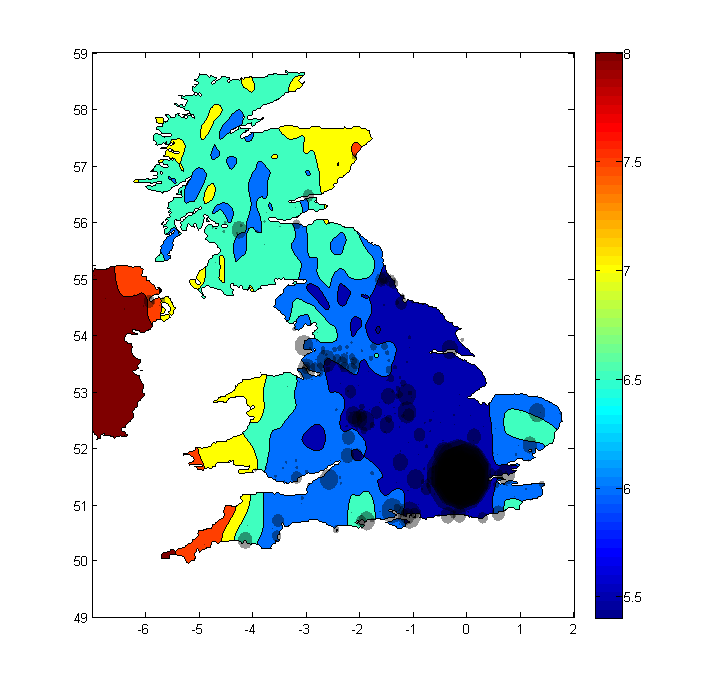
We’ve got some graphics to share, brought to you by our friend Sachin Navalkar. The first one combines wind speed and population density data, giving a more complete, more realistic image of where in the UK a wind turbine might be effective.
If you live within one of the shaded dots, then it’s likely that your local built environment prevents consistent, high speed winds from reaching your site. But if you live in an area not so densely populated, and your proposed site has a high average wind speed, then there might be a turbine with your name on it!
Keep in mind that bit about the local built environment. This map doesn’t account for orography — the zones are smoothed-over approximations, exempting hills and valleys from the data (see a more detailed map). As always, the best way to measure your site’s average wind speed is with an anemometer.
Remember too that power as a function of wind speed increases cubically, so each meter-per-second of wind speed counts a great deal. See “The Skinny on Small Wind” for more details.
The next graphic is on solar power. The video shows the variation of solar irradiation throughout the year, measured in kilowatt-hours per square meter; i.e., sunlight power density. Notice the difference between the summer and winter months, especially as you move away from the equator. The moral of this story: expect your panels to produce 2-3 times the power on a sunny summer day than on a sunny winter day.
If the embedded video doesn’t work for you, check it out here.
That’s all for now — we do hope you’ll stay tuned for updates this 2013.
